I have an attempt at redesigning the Notepad++ logo using the new style of icons presented by Microsoft for their Office suite. Here’s how it evolved. Warning: I’m not a professional designer!
The Inspiration
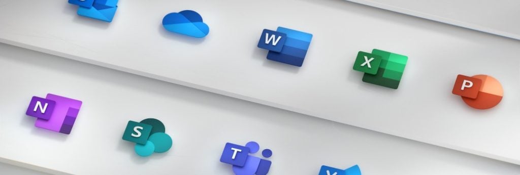
Microsoft office got some new icons, and I thought they looked very nice. A modern refresh of the old look. Then I noticed that of all the icons sitting on my taskbar, the old notepad++ icon stood out as the ugliest. So I decided to try and redesign it with the same kind of design style that was used in the new office logos.
There are two main parts to each of the icons: A stylised representation of the application in the background, and a branding letter in the foreground:
The Iterations
To replicate this with notepad++ I decided to keep the existing colours as much as possible – they are nice and recognisable. The greens and yellows are set quite apart from any other application icons I see on my system.
Initial Idea
I made the “app representation” be a simple rectangle similar to Word’s. For the foreground instead of using the usual abbreviation “n++”, which would never fit into a small square, I used “++”. Still fairly recognisable, right?

Something was missing though. The flash added by the pencil. Without that, the notepad logo just doesn’t sit right with me. So I recreated the pencil, this time fitting vertical aligned with the rest of the icon.
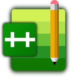
For a first iteration, I thought this looked pretty good. But when I rendered it as the small size of icon that shows up on the taskbar, well… It looks decent, but the “++” application text just isn’t visible at all. In the start menu’s slightly larger icon size you can just about make it out. Clearly, that won’t cut it. The pencil, too, is only just about visible.

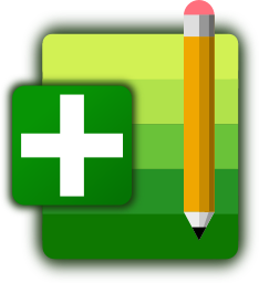
So instead, I tried rendering with only a single “+” to see how that looks. At lower sizes, it’s instantly much more recognisable.
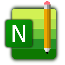
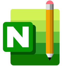
What about just an “N” then? I know we’re starting to stray from the usual “n++” branding, but maybe that’s a worthwhile tradeoff? The tricky thing here is that you can’t really pick a font N that looks good at a large size and at a small size. Why not do different icons depending on the size, then? A regular N font at large scale, and then use a blocky, nice and visible N for the smaller icons.
This is starting to look pretty good now! Though I think I prefer the blockier N, even at a large size.
Ditch those Gradients
One thing the design of the office icons aimed to strive for was simplicity – they were prototyped using paper, if their blog post is to be believed. Right now I’m differentiating between the fore- and background elements using a gradient blur. What if I swap this out for a solid background and just do away with the gradients altogether? I would need to just get rid of that altogether on the small icon else the icon will start to get too busy.
The only thing that I think the icon needs is a special rework at the smallest resolution that I come across – 24px high. Here, the level of details are difficult to make out. For this, going by the office icons, the icon should be a bit more square. I also question whether the pencil should be visible at this level. Even the original notepad++ icon ditches the pencil at the smallest resolution. I’ll also remove the corner rounding – at this scale it’s not even visible.

At small resolutions this looks great! I think I might be closing in on a great solution. For this smaller icon I tried to fill up as much of the 24x24px square as possible. I should probably re-work the larger icons to match this. Starting to wonder about the pencil, it’s slanted in the original icon. Maybe a bit of asymmetry / misalignment might actually look good on the larger icons that show the pencil?
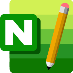
At this final stage, I made a bunch of different combinations of all of the above. I’m not sure which I like best. Taking out the pencil doesn’t look too bad, I might well use that version at all scales. It’s at this point that my total lack of design knowledge starts to show. The most minuscule things can make or break an icon.
Software Used
Anyway, there’s a little insight into the stages I went though while prepping these icons. I designed the lot using Inkscape, my vector graphics editor of choice. It’s really good for making this kind of icon, but it exports everything as PNGs. So I churn them out, then use ImageMagick‘s convert script to combine them all into a single file.
Final Versions
I’ve made some downloads of the final icon versions, including a converted .ico format with all in one, available at this page: https://github.com/LonMcGregor/NotepadPlusPlusIcons
If anyone from the notepad++ development team comes across this, please take note. I’m not saying my design is perfect, but along with other modern icon designs on taskbars and launchers it looks a lot nicer:

What next?
This was a pretty simple design attempt. It would be worth throwing around some other ideas for the kind of background motif to use, beyond a plain rectangle. A better way of incorporating the pencil would also be nice. Investigating some proper fonts and typography of the N is needed – it doesn’t fit quite right just now.





I would prefer the icon with the pencil. How about using the iconic lizard?
That’s a good point 👍. I usually never see the lizard outside of the installer, but that might be nice to integrate somehow.
Love it! Would love to see one in the future for Dashlane and Vivaldi :O Great job!
Very nice work! 👏
Great work and good thinking!!!!!
Came across this looking for a Win desktop folder icon with a Notepad++ logo. Personally, I find the “+” more instantly recognizable, not to mention more aesthetically pleasing, notwithstanding wanting to echo the MS logos. Give a yell if you ever decide to affix this to a desktop folder icon!
Excellent work bro. Thanks for this!
Looking at the task bar of my Windows 11 PC the main issue is the way different logos have different baselines. Windows Mail and Kee-pass seem to use most of the square icon space, as indeed does Notepad++. Vivaldi slightly less and is square, Windows Explorer around the same height but wider, the command prompt and task manager appear to be less deep and “float” above the baseline. Now simplifying everything to a coloured square and a letter may make it look a little less of a mess but may not provide enough information for the users, particularly if they are not used to English.